
Short answer: soft daylight, phone at seat or table-top height, the 2× lens (or step back), a clear background, and the same six shots for every piece: front, three-quarter, side, back, material close-up and flaws.
1. Set up the light
Light matters more than the camera. Move the piece near a large window, an open garage door or into shade outside on a bright day. Turn off ceiling lights and lamps so you don’t mix warm and cool light, which makes wood look orange and fabric look grey. Avoid direct sun: it creates hard shadows and blows out pale upholstery.
2. Clear the background
Pull the piece about a metre (3 ft) away from the wall so it doesn’t cast a shadow on it, and move anything else out of the shot. A plain wall, a sheet hung behind it or a clean floor is enough. You don’t need a white backdrop. You can make a clean studio or room version of the photo afterwards.
3. Get the camera height and lens right
| Piece | Camera height | Tip |
|---|---|---|
| Chairs and armchairs | Seat height | Shows the seat and the back without making the legs look splayed |
| Sofas | Seat height, from straight on and a three-quarter angle | Step back and use 2× so the near arm doesn’t look huge |
| Tables and desks | Just above the top | Add one shot from higher up to show the surface |
| Dressers and sideboards | Middle of the front | Keep vertical lines straight; tilt the phone and they lean |
| Shelves and bookcases | Middle height, straight on | Style two or three shelves lightly, leave the rest empty |
Use the 2× lens or step back and zoom a little. The wide lens bends straight edges and makes whatever is nearest the camera look too big.
4. Take the six shots
- Front, whole piece, centred.
- Three-quarter angle (the most flattering view for most furniture).
- Side.
- Back.
- Close-up of the material: grain, weave, hardware, joinery.
- Close-up of any flaws, in the same light.
5. Make the other versions you need
Different places want different photos: a clean background for marketplaces and your shop grid, a room setting for your homepage and Instagram, a seasonal scene in November and December. Instead of restaging the piece, start from your best front or three-quarter photo.
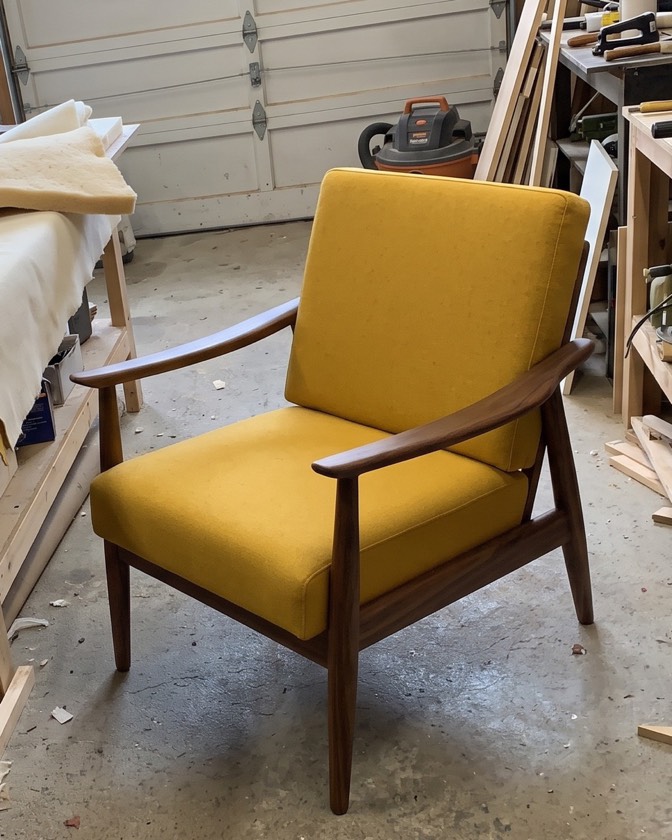
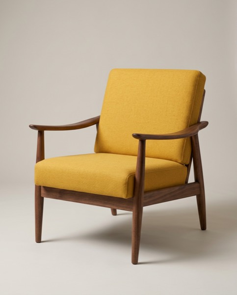
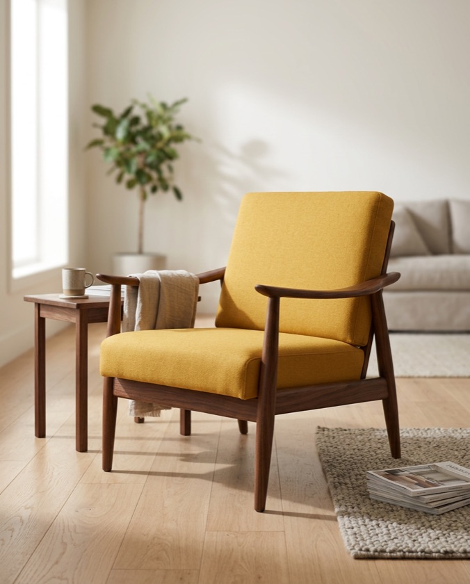
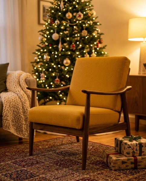
This armchair was photographed once, in the workshop. The studio, lifestyle and Christmas versions were made from that photo by SnapStudioAI, with the chair itself kept the same.
Common mistakes
- Shooting from standing height: chairs look short and tables look like a top view.
- Mixed light: a yellow lamp on one side and blue daylight on the other.
- Busy backgrounds that hide the shape of the piece.
- Hiding the flaws. They show up at pickup anyway, and the sale falls through.
- Editing the colours to look “nicer”. Buyers want the colour they’ll get.
Questions sellers ask
What is the best light for furniture photos?
Daylight from a window or an open garage door, without direct sun on the piece. Turn off ceiling lights so you don’t mix warm and cool light.
What height should I hold the phone?
About the height of a chair seat or a table top. From standing height, chairs and tables look short and the legs look splayed.
Should I use the phone’s wide or 2× lens?
Use 2× or step back a little. The wide lens bends straight edges and makes the part nearest the camera look too big.
Do I need a white background?
Only for marketplaces that ask for one, like Amazon. A plain wall is enough for most shops, and you can make clean studio or room versions of the same photo afterwards.